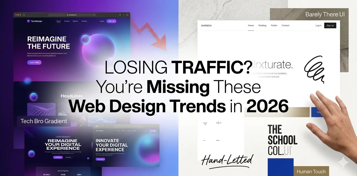
Losing Traffic? You’re Missing These Web Design Trends in 2026
Let’s be honest. “Top Web Design Trends for 2026” is a phrase you’ve seen a hundred times and most of those articles say the same thing.
But here’s what they’re missing: your clients don’t need award-winning websites. They don’t need a site that wins an Awards trophy and gets zero inquiries. They need a site that helps their business grow. Full stop.
And right now, there’s a bigger problem quietly killing websites.
Table of Contents
- Barely There UI: The Art of Designing With Almost Nothing
- Maximalism: Bold, Loud, and Deliberately Overwhelming
- Wabi Sabi: The Japanese Philosophy That Is Reshaping Web Aesthetics
- Human Touch: Handdrawn Elements and Unpolished Images
- Grade School Color Palettes: Primary, Bold, and Unapologetically Basic
- Spaceship Instruction Manual: Technical Meets Beautiful
- Democratized Fancy Animations: High-End Motion for Every Budget
- Internet Nostalgia: When the Early Web Becomes the Inspiration
- The Tab That’s Playing Music: Sound Design Comes to the Web
- Tech Bro Gradient: The AI Startup Aesthetic Goes Mainstream
- Frequently Asked Questions (FAQs)
We are all designing with AI tools. Same layouts. Same patterns. Same typography. Same hero sections with a gradient background and a bold headline that says “Reimagine the future.” Open ten competitor websites in your industry today and count how many look identical, but you’ll stop counting around five.
Web Design Trends in 2026 is not about better polish. It’s about personality.
The real question visitors are asking when they land on your site isn’t “does this look modern?” It’s something much more instinctive: did a human make this or did a prompt?
Because interactive 3D, fluid animations, and pixel-perfect layouts are now table stakes. Any AI tool can produce them in minutes. What AI cannot produce is genuine character. A point of view. A design that feels like it was made by someone who actually understands your brand, your customers, and your story.
That’s what the web design trends actually worth paying attention to in 2026 are delivering. Not more of the same in a shinier wrapper — but a completely different approach to what a website can feel like.
Here are the 10 Web Design Trends in 2026 that are genuinely reshaping the web this year.
Barely There UI: The Art of Designing With Almost Nothing
Imagine opening a website and almost not noticing the interface at all. No heavy navigation bars. No cluttered sidebars. No buttons screaming for your attention. Just content, breathing space, and a design so restrained it feels invisible.
That is Barely There UI. It is one of the most sophisticated website design trends gaining momentum in 2026. It is minimalism taken to its logical extreme, born directly as a reaction to how AI tools have flooded the web with visually busy, over-designed templates.
The philosophy is simple: the less your UI gets in the way, the more your content can do the talking. Think almost-hidden navigation that appears only on scroll, ultra-thin typography, generous white space, and interactions so subtle they feel like breathing.
Who is using it well?
High-end editorial brands, luxury product companies, and premium service firms are leading this trend. If your brand relies on trust, and letting the work speak for itself, Barely There UI could be your most powerful best web design practice this year.
Business Takeaway:If your website feels cluttered or busy, Barely There UI is not just a trend, it is a conversion strategy. Less friction means more focus on your core message and call to action.
Maximalism: Bold, Loud, and Deliberately Overwhelming
Sitting at the exact opposite end of the spectrum is Maximalism — and the asterisk matters here. This is not just “more stuff on a page.” This is a deliberate, strategic decision to use bold typography, layered visuals, clashing colours, dense compositions, and overflowing energy to create an experience that stops the scroll instantly.
In 2026, modern web design is splitting into two distinct camps: those going barely there, and those going all the way. Maximalism works because it is impossible to ignore. Brands like Liquid Death have built entire identities around this approach — loud, irreverent, and unmistakably memorable.
For businesses in entertainment, fashion, food and beverage, youth culture, or any brand that wants to signal confidence and personality, Maximalism is one of the most effective website design trends available right now.
The rules of good Maximalism
- Every element must serve a purpose — chaos with intention, not chaos for chaos’s sake
- Typography should be oversized and expressive, not just decorative
- Colour combinations should feel bold but not random
Business Takeaway: Maximalism is not for every brand but if your competitors all look safe and similar, going bold could be your strongest differentiator. A skilled web design company can help you maximize impact without sacrificing usability.
Wabi Sabi: The Japanese Philosophy That Is Reshaping Web Aesthetics
Wabi Sabi is a Japanese aesthetic philosophy centred on finding beauty in imperfection, impermanence, and incompleteness. And in 2026, it has found its way into modern website design in a big way.
As AI-generated imagery becomes smoother, more perfect, and more indistinguishable from reality, audiences are instinctively gravitating toward the opposite. Wabi Sabi design embraces rough textures, organic irregularities, asymmetric layouts, muted earthy tones, and visuals that look like they were made by a human hand — because they were.
This trend sits at the intersection of sustainability, authenticity, and emotional connection. It is particularly powerful for wellness brands, artisan businesses, independent retailers, and any website design for small business that wants to feel genuinely personal rather than corporate.
What Wabi Sabi looks like in practice
- Linen-textured backgrounds and paper-grain overlays
- Hand-lettered typography mixed with clean body fonts
- Photography that feels candid and unretouched
- Layouts that deliberately break the grid
- Colour palettes inspired by soil, stone, rust, and moss
Business Takeaway: In a sea of AI-perfect websites, Wabi Sabi builds trust precisely because it looks human. For UK and Australian businesses especially, where authenticity and craft are highly valued by consumers, this trend is worth serious consideration.
Human Touch: Handdrawn Elements and Unpolished Images
Closely related to Wabi Sabi but distinct in its execution, the Human Touch trend is about deliberately injecting imperfection into your design system. We are talking hand-drawn illustrations, squiggly underlines under text, doodle-style icons, scribbled annotations, and photography that looks like it was shot on a phone rather than in a studio.
This trend is a direct response to AI. As generative tools produce increasingly flawless visuals, the internet is starting to feel sterile. Human Touch design fights back by making the maker visible — showing that real people, with real hands, created something for real customers.
Among the best web design practices gaining traction with leading website design companies in 2026, Human Touch is one of the most accessible. You do not need a massive budget — you need the intention to be authentic.
Two core elements of Human Touch design
- Handdrawn Elements
Think rough sketch-style icons, imperfect borders, handwritten callouts, and illustrated characters that feel warm and approachable. These elements signal that your brand has personality — not just a colour palette.
- Unpolished Images
Real photography over stock. Behind-the-scenes moments over posed product shots. Images that look like they came from someone’s phone — because sometimes they did. This rawness creates connection in a way that a perfectly lit studio shot simply cannot.
Business Takeaway: If you are running affordable web design for small business clients, Human Touch design is a game-changer. It is cost-effective to implement and creates an emotional resonance that expensive, over-designed sites often miss entirely.
Grade School Color Palettes: Primary, Bold, and Unapologetically Basic
Remember the colours from your primary school art class? Red, yellow, blue, green — pure, unblended, straight-from-the-tube colours. In 2026, those Grade School Color Palettes are having a major moment in web design.
This trend sits within the broader modern web design movement away from the muted, sophisticated palettes that dominated the early 2020s. Grade School colours feel energetic, optimistic, and instantly recognisable. They communicate confidence without trying too hard — and they stand out dramatically on a web full of beige and grey.
Brands targeting younger audiences, creative industries, and consumer products are leading this trend. But it is also appearing in unexpected places — B2B software companies, education platforms, and even some financial services brands looking to shed a stuffy image.
How to use Grade School colours without looking childish
- Pair with strong, clean typography to anchor the boldness
- Use as accent colours rather than full backgrounds where appropriate
- Limit your palette to two or three primary colours maximum
- Balance with plenty of white space — the contrast does the work
Business Takeaway: Grade School palettes work best for brands that want to feel approachable, energetic, and memorable. If your current website palette feels safe and forgettable, this is one of the most impactful website design trends you can test.
Spaceship Instruction Manual: Technical Meets Beautiful
This is one of the most intriguing web design trends in 2026 — and one of the least written about. The Spaceship Instruction Manual aesthetic takes the visual language of technical documentation — precise diagrams, numbered callouts, grid-based layouts, monospaced fonts, specification-style typography — and turns it into something genuinely beautiful.
Think NASA manuals reimagined as brand websites. Dense with information but meticulously organised. Every element has a purpose. Every label is intentional. The overall impression is one of deep expertise and mastery — a brand that knows exactly what it is doing and is not afraid to show it.
This trend is particularly powerful for tech companies, engineering firms, SaaS products, and any web design for business context where demonstrating technical credibility is essential to winning trust.
Key visual characteristics:
- Monospaced or technical typefaces alongside clean sans-serifs
- Numbered annotations and labeled diagram-style layouts
- High information density with strong visual hierarchy
- Dark backgrounds with precise, light-coloured details
- Data visualisations presented as design elements
Business Takeaway: If your business sells expertise — software, engineering, consulting, data — the Spaceship Instruction Manual aesthetic signals authority and depth in a way that generic corporate design never can.
Democratized Fancy Animations: High-End Motion for Every Budget
Until recently, the kind of smooth, cinematic animations you would see on award-winning websites were reserved for brands with enormous budgets and specialist development teams. In 2026, that has completely changed.
New tools and platforms have democratised fancy animations — making scroll-triggered effects, 3D product showcases, morphing shapes, kinetic typography, and parallax storytelling accessible to businesses of all sizes. This is one of the most significant shifts in modern web design this year.
The top web development companies are already building these capabilities into standard project scopes. What was once a luxury add-on has become an expectation — particularly among audiences in the USA and UK who are accustomed to app-quality digital experiences.
What democratised animations look like in 2026
- Scroll-triggered section reveals that bring content to life as you move down the page
- 3D product models that visitors can rotate and explore
- Text that morphs, types itself out, or transforms on scroll
- Smooth page transitions that make navigation feel like an experience
- Hover states that respond intelligently to cursor position
The golden rule: animation should always serve a purpose. Motion that guides attention and rewards interaction is powerful. Motion that exists purely for spectacle will slow your site and frustrate visitors.
Business Takeaway: As a web design agency working with businesses globally, we implement these animations with performance in mind — every effect is tested against Core Web Vitals to ensure your site stays fast and ranks well.
Internet Nostalgia: When the Early Web Becomes the Inspiration
The early internet was chaotic, colourful, and deeply human. GeoCities pages with blinking text. Hit counters at the bottom of every page. Tiled backgrounds and comic sans in places it had no business being. It was imperfect — and that imperfection made it feel alive.
In 2026, Internet Nostalgia is having a serious design moment. Brands are deliberately borrowing visual cues from Web 1.0 and early Web 2.0 — pixel fonts, retro cursor effects, lo-fi graphics, scanline textures, and interface elements that feel like they were built in 2003 — and making them feel cool again.
This trend connects deeply with Millennial and Gen Z audiences who have either lived through that era or grown up consuming it as aesthetic reference. It signals authenticity, personality, and a brand confident enough to be playful.
Where Internet Nostalgia works best
- Creative agencies and design studios positioning themselves as culturally aware
- Music, gaming, and entertainment brands
- Independent retailers and DTC brands targeting Millennial and Gen Z buyers
- Any brand that wants to feel like a person, not a corporation
The key is intentional nostalgia. A retro cursor or pixel-style illustration used deliberately feels clever. The same elements applied without thought just look dated. The best web design practices around this trend are all about balance — enough nostalgia to evoke feeling, enough modernity to remain usable.
Business Takeaway: Internet Nostalgia is not about making your website look old. It is about borrowing the emotional warmth of a more personal internet era and using it to make your modern website feel less corporate and more connected.
The Tab That’s Playing Music: Sound Design Comes to the Web
You know the feeling. You open a dozen browser tabs, and somewhere in the stack, something is playing audio. You frantically search for the culprit tab. It is annoying when it is accidental — but in 2026, intentional sound design on websites is becoming one of the most talked-about web design trends in 2026.
This is not about auto-playing music that hijacks your speakers. This is about purposeful auditory feedback — subtle click sounds when navigating, ambient audio that reinforces a brand’s atmosphere, sound effects tied to micro-interactions, and music experiences that visitors actively choose to engage with.
Brands like Spotify, Nike, and a growing number of creative agencies are leading this trend. It is also appearing in website design for small business contexts — particularly independent music producers, hospitality brands, and luxury retailers who want their website to feel like a full sensory experience.
How sound design works in web design
- Optional ambient soundscapes that visitors can toggle on or off
- Subtle UI sounds that confirm interactions — clicks, transitions, form submissions
- Music players embedded seamlessly into the design rather than bolted on
The critical rule here: always make sound optional. Auto-playing audio without consent is one of the fastest ways to lose a visitor. Sound design works when it is a reward, not an ambush.
Business Takeaway: Sound is the most underused dimension of web design. For brands in hospitality, retail, entertainment, or any business where atmosphere matters, a thoughtful audio layer can create a genuinely memorable experience that sets you apart from every competitor.
Tech Bro Gradient: The AI Startup Aesthetic Goes Mainstream
You have seen it everywhere. Dark background. Deep purple bleeding into electric blue. Maybe a hint of teal or magenta. Glowing orb somewhere in the hero section. Text that says something like “The future of work, reimagined.” This is the Tech Bro Gradient — and in 2026, it has gone from a Silicon Valley cliché to a fully mainstream modern website design aesthetic.
What started as the visual language of AI startups — OpenAI, Anthropic, Midjourney — has spread across SaaS, fintech, and professional services. The gradient signals innovation, intelligence, and forward momentum. When done well, it is genuinely striking. When done lazily, it looks like every other startup on ProductHunt.
The evolution in 2026 is that web design agencies and website design companies are starting to customise this gradient language to individual brands — rather than applying the same purple-to-blue formula to every tech client. Brand-specific gradient systems, mesh gradients, and gradient typography are all part of how this trend is maturing.
How to use Tech Bro Gradients without looking generic
- Develop a gradient palette specific to your brand colours — do not just copy the OpenAI look
- Use gradients on typography and individual elements, not just full-screen backgrounds
- Pair with clean, confident typography to prevent the gradient from feeling like wallpaper
- Combine with the Spaceship Instruction Manual aesthetic for a powerful tech-authority look
Business Takeaway:If you are a tech company, SaaS product, or professional services firm, a well-executed Tech Bro Gradient tells visitors immediately that you are in the innovation space. The key is making it yours — not borrowing someone else’s identity.
The Question Every Business Should Ask Before Following Any Trend
Here is the most important thing the designer behind these trends said — and it is more valuable than any individual trend on this list:
“Don’t ask: what cool trend can I jump on? Ask: what skills do I need to develop?”
In other words — trends are tools, not identities. The best web design practices in 2026 are not about applying every trend you see. They are about understanding which trends align with your brand, your audience, and your goals — and implementing them with intention and craft.
A Wabi Sabi aesthetic works beautifully for an artisan skincare brand but would undermine trust on a fintech platform. Maximalism is perfect for a streetwear label but completely wrong for a legal firm. Barely There UI suits a luxury hotel but would make a busy eCommerce store feel empty and directionless.
The brands winning online in the UK, USA, Canada, and Australia right now are not the ones chasing every trend. They are the ones who deeply understand their audience and make deliberate, strategic design choices that serve that audience.
That is what separates a great web design company from an average one. And it is what separates websites that generate enquiries from websites that just exist.
Ready to Build a Website That Actually Works in 2026?
At Ingenious Netsoft, we are a global web design agency and website design company with over a decade of experience building high-performance websites for businesses across the UK, USA, Canada, and Australia.
We do not just follow web design trends in 2026 — we understand which ones are right for your specific brand, audience, and goals.
Whether you need affordable web design for small business or a full enterprise redesign, our team combines strategic thinking with genuine design craft. We build websites that look exceptional, load fast, rank well, and — most importantly — convert visitors into customers.
From modern web design and custom animations to eCommerce and WordPress development, we cover everything your business needs to compete online in 2026 and beyond.
Get in touch with Ingenious Netsoft today and let’s talk about what your website could be.
Your website is your most powerful sales tool. Make it count in 2026.
Frequently Asked Questions (FAQs)
Q1. What are the biggest web design trends in 2026?
The biggest web design trends in 2026 are not what most blogs will tell you. Beyond the usual mobile-first and dark mode advice, the trends actually making an impact right now are Barely There UI, Wabi Sabi aesthetics, Human Touch design with hand-drawn elements, Democratized Fancy Animations, Internet Nostalgia, Grade School Color Palettes, Tech Bro Gradients, and intentional Sound Design. What ties them all together is one shift: personality over polish. In 2026, the websites winning attention are the ones that feel human — not the ones that look most expensive.
Q2. How do I know which web design trend is right for my business?
Stop asking “what cool trend can I jump on?” and start asking “what does my audience actually need to feel?” A Wabi Sabi aesthetic works beautifully for an artisan brand but would undermine trust on a fintech platform. Maximalism is perfect for a streetwear label but wrong for a law firm. The right trend is the one that aligns with your brand personality, speaks to your specific audience, and supports your conversion goals — not the one that looked impressive on someone else’s website.
Q3. Does web design really affect SEO rankings?
Absolutely — and more than most business owners realise. Google’s Core Web Vitals directly measure design-related performance signals including load speed, visual stability, and interaction responsiveness. Only 47% of websites currently meet all three thresholds. Beyond technical performance, design affects bounce rate, time on page, and click-through rate — all of which influence how Google ranks your site. A well-executed modern web design is not just good for visitors, it is good for search visibility.
Q4. How much does web design cost for a small business in 2026?
The cost of website design for small business varies significantly depending on scope, features, and the agency you work with. A basic professionally designed website typically starts from £1,500–£3,000 in the UK or $2,000–$5,000 in the USA and Australia. A more feature-rich site with custom animations, eCommerce functionality, or CMS integration will naturally sit higher. The more important question is ROI — a well-designed website that converts even a small percentage better can pay for itself within weeks. Affordable web design for small business does not mean cheap — it means strategic investment.
Q5. How often should I redesign my website?
As a general rule, a full website redesign is worth considering every 3 to 4 years — or sooner if your bounce rate is climbing, your conversion rate is dropping, or your site looks visibly dated compared to competitors. That said, your website should never be truly “finished.” The best performing websites are treated as living assets — updated regularly with fresh content, performance improvements, and design refinements that keep them competitive. If your site was built before 2022 and has not been touched since, it is almost certainly costing you business right now.
Q6. What is the difference between a web design agency and a web design company?
In practice, the terms web design agency and web design company are often used interchangeably. However, an agency typically implies a broader team offering strategy, design, development, and digital marketing under one roof — whereas a web design company may focus more specifically on the build itself. When choosing a partner, what matters more than the label is whether they take time to understand your business goals, your audience, and the outcomes you need — not just your colour preferences and logo.
Q7. Can I implement these 2026 web design trends on my existing WordPress website?
Yes — most of these trends can be applied to an existing WordPress site without a full rebuild. Human Touch elements like hand-drawn illustrations, updated typography, and refreshed photography can often be implemented quickly. Democratized Fancy Animations can be added via modern plugins or lightweight custom code. Grade School Color Palettes and Tech Bro Gradients are largely CSS updates. More structural changes like Barely There UI or full Maximalism may require a more significant redesign. A good web design agency will audit your current site and recommend the most cost-effective path to modernising it.